5Why Package Design
Client / 5Why
Services / Strategy, Identity, Product, Package & Application
© 2021 GRAFY.
Brand Definition
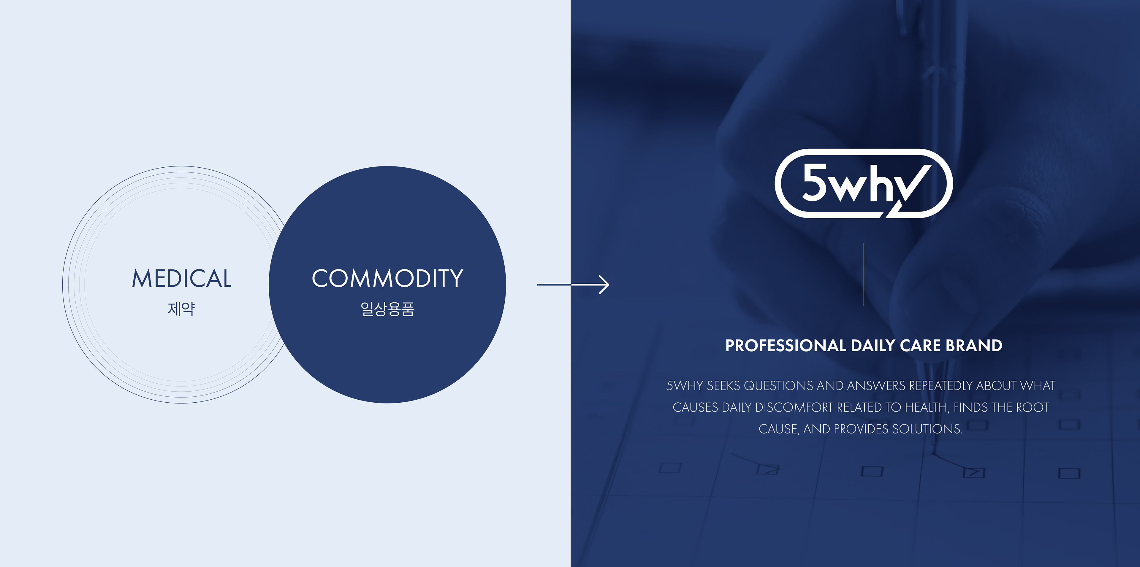
보령컨슈머는 환자를 위해 약을 만들던 제약회사로서, 언제나 과학적인 기술력과 까다로운 시선으로 납득이 가능한 제품을 생산해왔습니다. 생활 개선 브랜드 5Why는 보다 먼저 고객의 건강과 관련된 일상에서의 불편함이 무엇 때문인지 다섯 번 묻고, 다섯 번 생각하는 자세로 일상의 문제를 과학적인 솔루션을 통해 일상을 케어하고자 합니다.
Boryung Consumer, as a pharmaceutical company that made medicines for patients, has always produced products that can be understood with scientific technology and a demanding gaze. 5why, a lifestyle improvement brand, wants to take care of daily life through scientific solutions by asking the customer what is the cause of the inconveniences in daily life related to health five times and thinking five times.
Brand Essence
5why의 제품의 특징과 다양한 제품군에 적용될 수 있는 브랜드 아이덴티티를 보여주기 위해, 보다 간결하고 유연한 브랜드 디자인을 추구합니다. 그러기 위해, 브랜드 디자인의 모든 요소에서 5why만의 에센스를 표현합니다.
In order to show boryung 5why's product features and brand identity that can be applied to various product groups, we pursue a more concise and flexible brand design. To that end, we express the essence of 5why in every element of the brand's design.
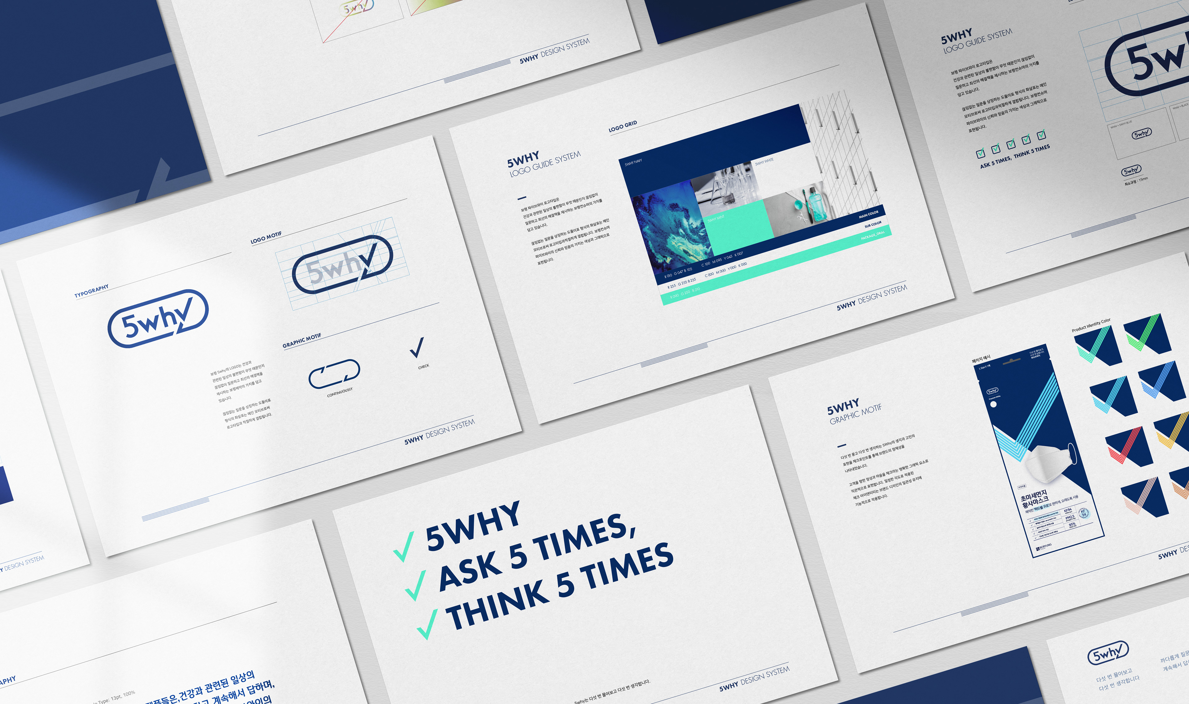
Brand Logo
보령 5why의 로고에는 상시 일상속 건강과 관련한 불편함에 대한 질문과 그에 대한 최선의 해답을 찾으려는 보령제약의 가치를 담고 있습니다. 도도리 테이블의 형태를 닮아 끊임없는 질문을 상징하는 화살표는 메인 모티프로써 로고타입과 적절하게 조합됩니다.
The Logo of Boryung 5why contains the value of Boryung Pharmaceutical, which constantly asks what is the cause of the daily inconveniences related to health and provides the best solution. The arrow in the form of a dodori table, which symbolizes endless questions, is properly combined with the logotype as the main motif.
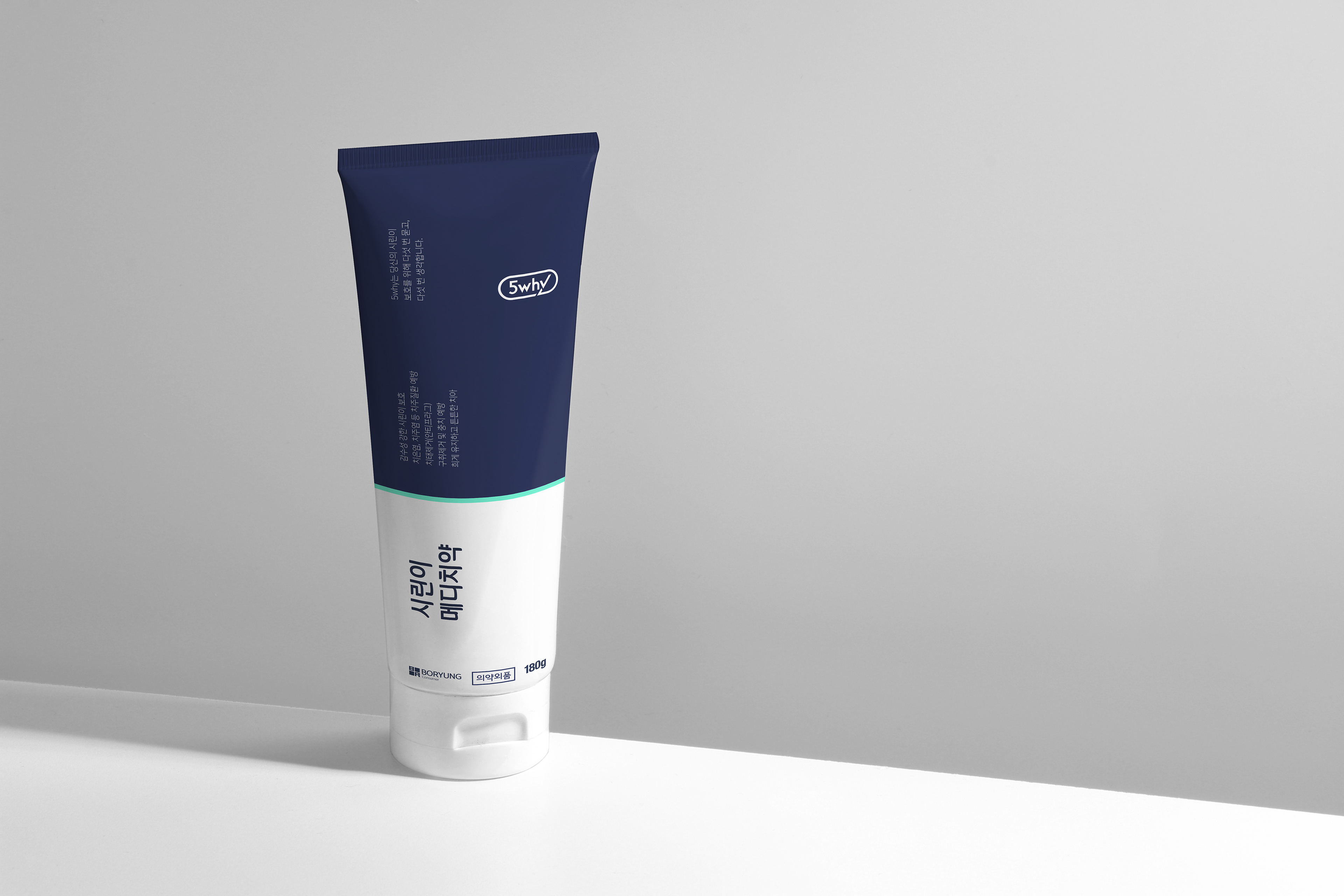
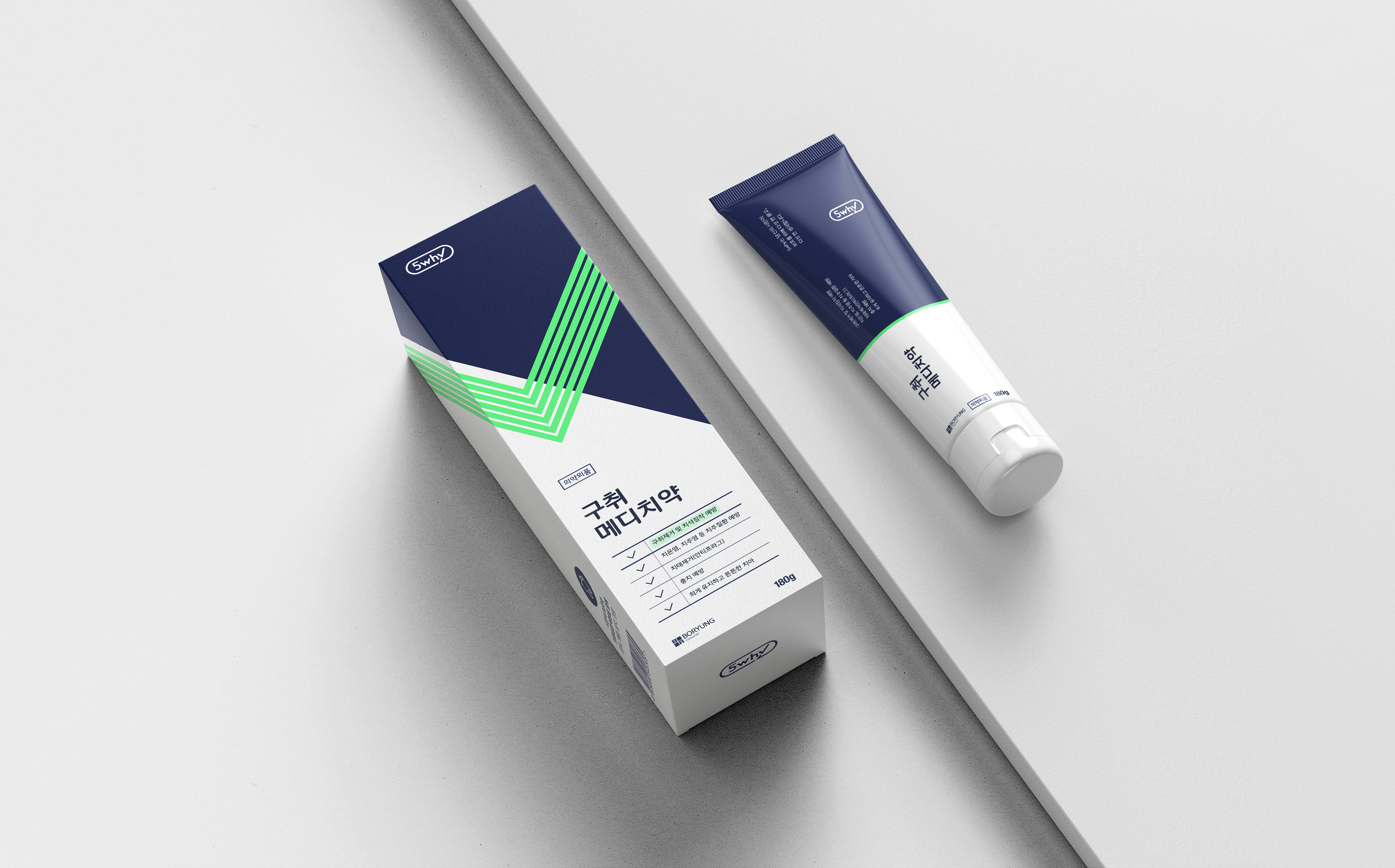
Color System
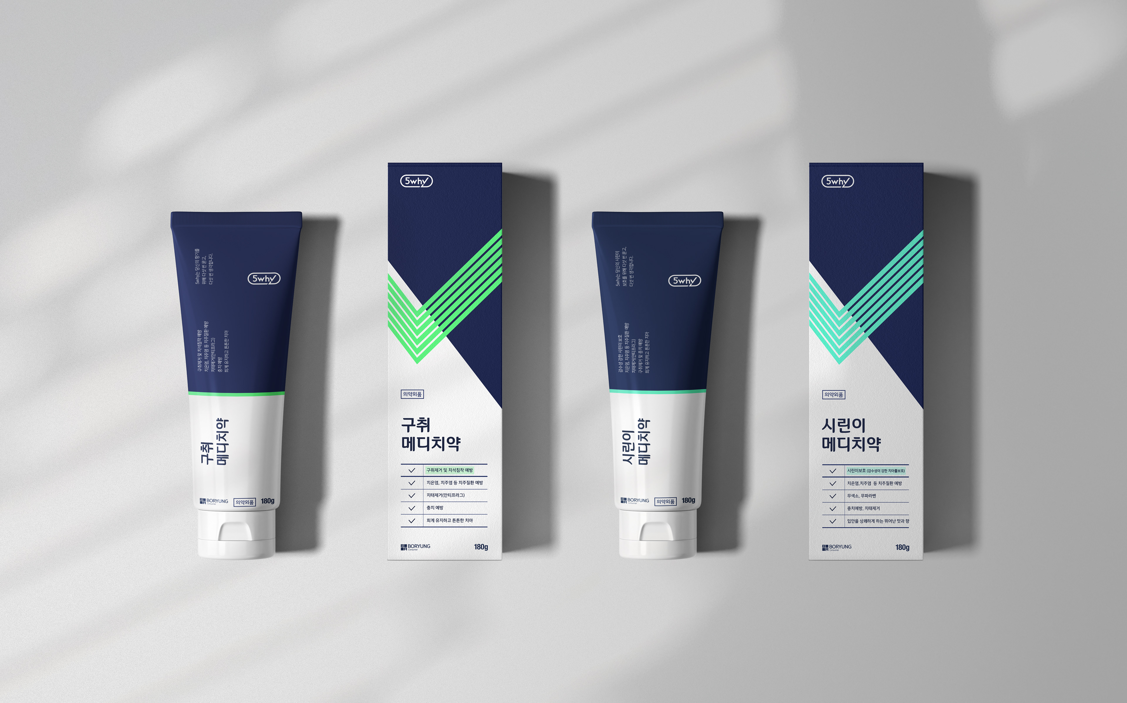
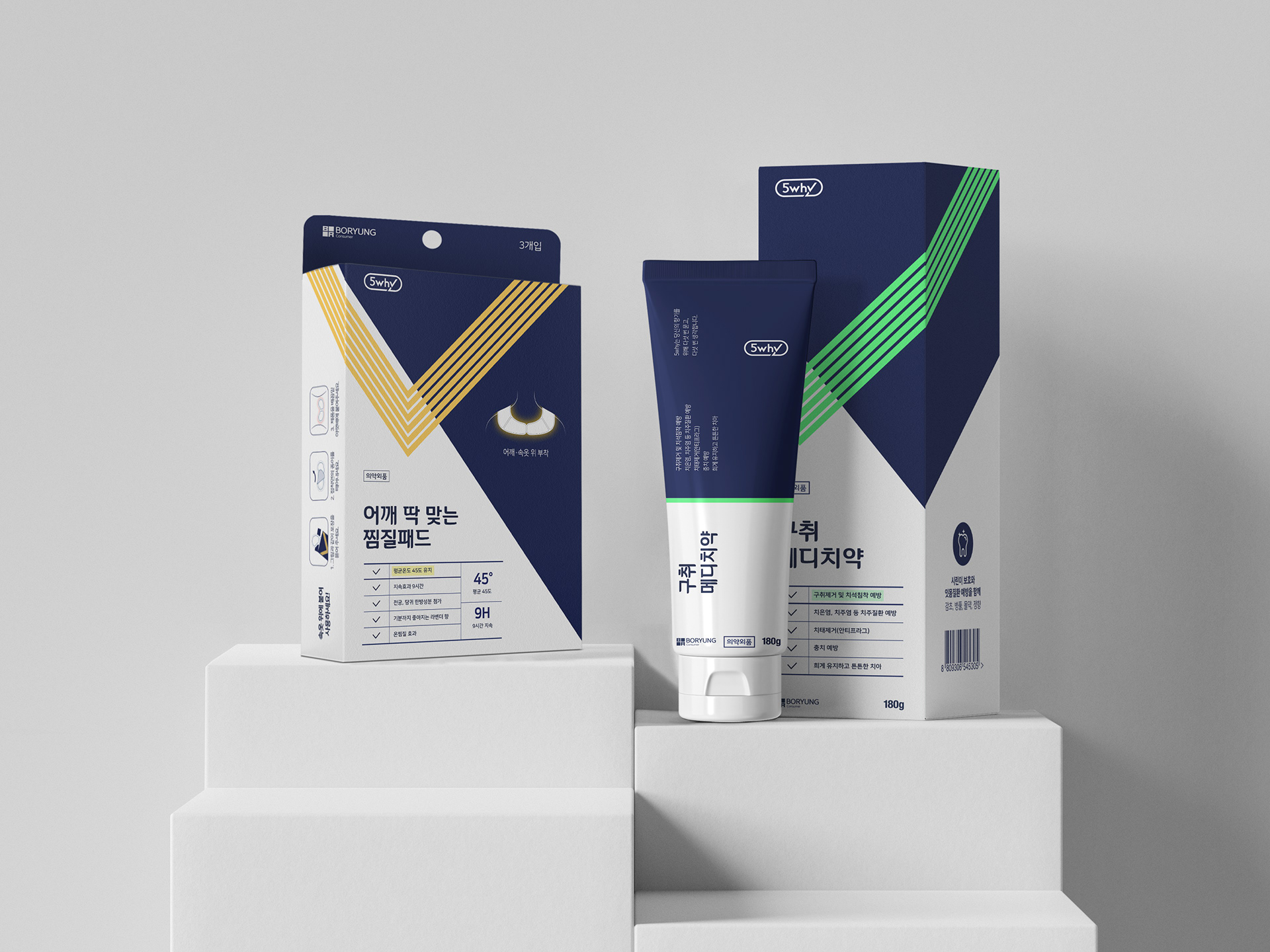
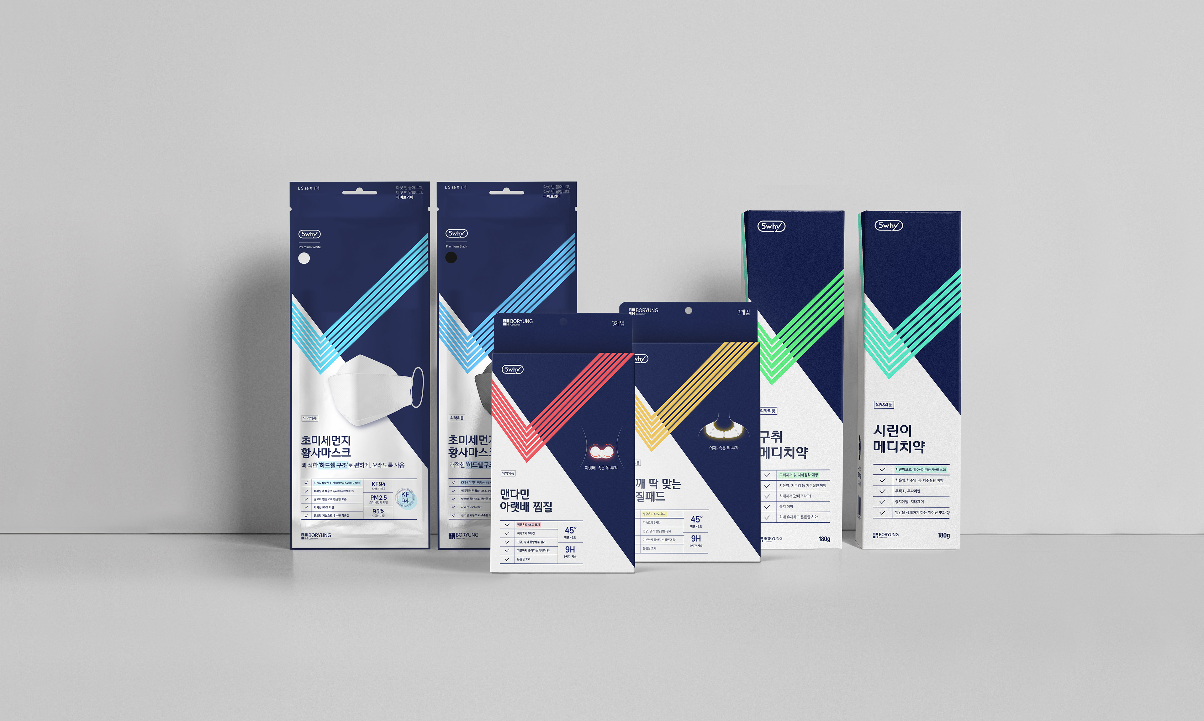
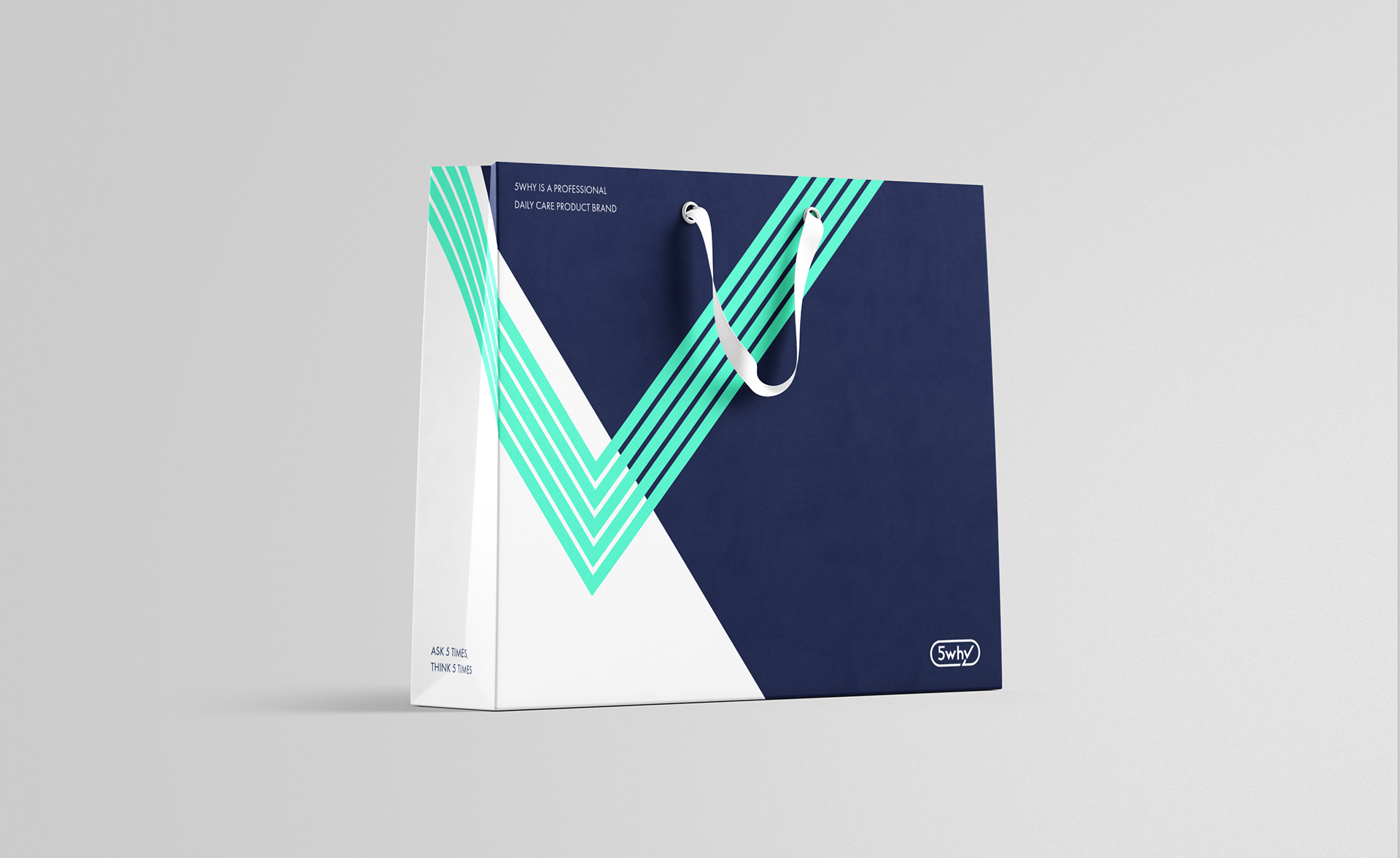
5Why 네이비는 메인컬러로써 제약 기업의 전문성과 신뢰성을 손쉽게 보여줍니다. 게다가 5why의 독특한 아이덴티티 모티프는 일상에 표시할 부분을 표시할 하이라이터 펜 혹은 중요한 부위를 표시하는 선을 나타내며 선정된 형광 색상들은 제품의 특성을 나타내는데 효과적으로 사용됩니다.
The main color, 5why NAVY, more easily shows the professionalism and reliability of pharmaceutical companies. In addition, 5why's unique identityThe motif is a highlighter pen used to check (check) in daily life or underline important parts to show,The color of the product was selected as a fluorescent series suitable for the characteristics of the product.

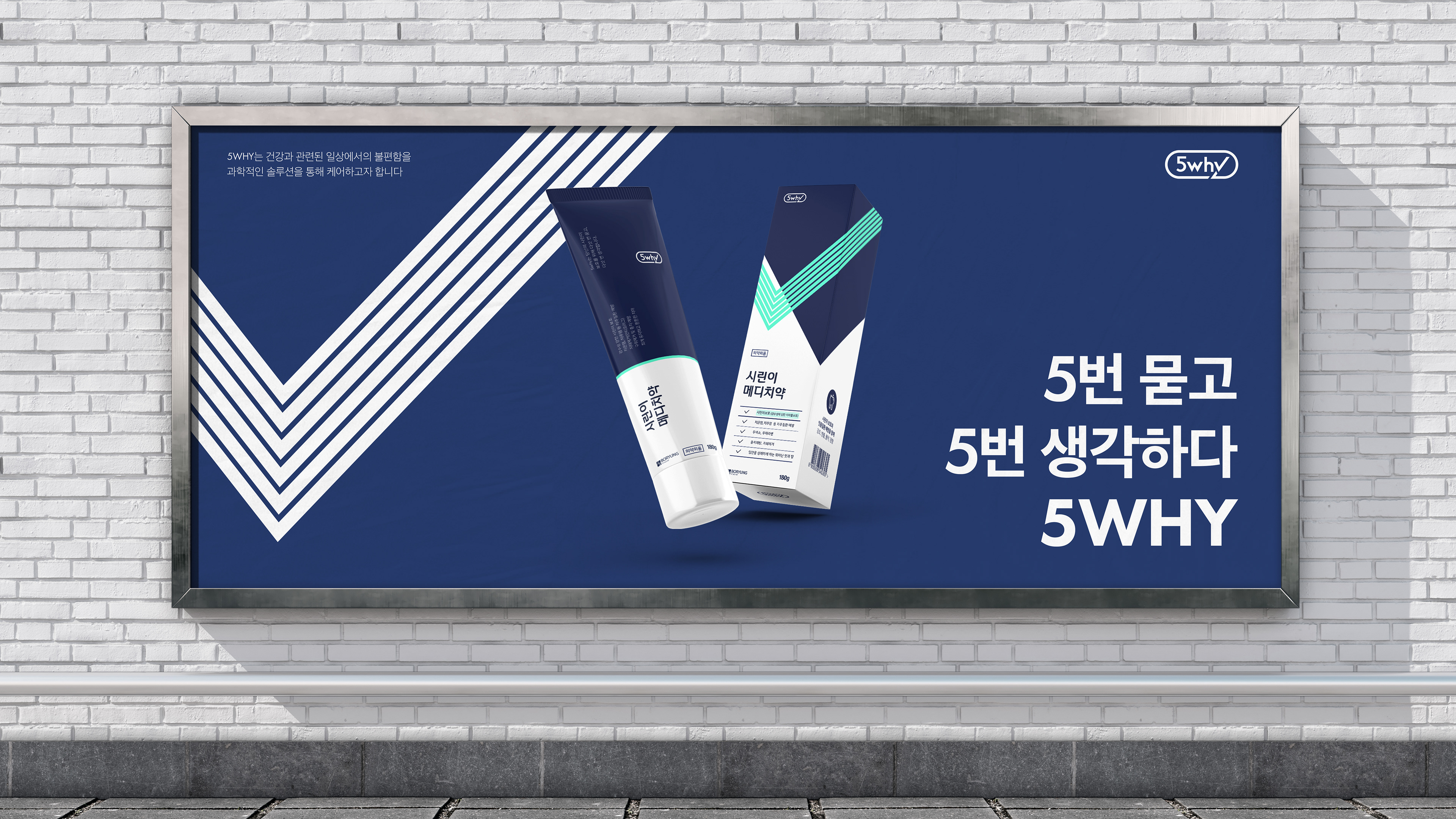
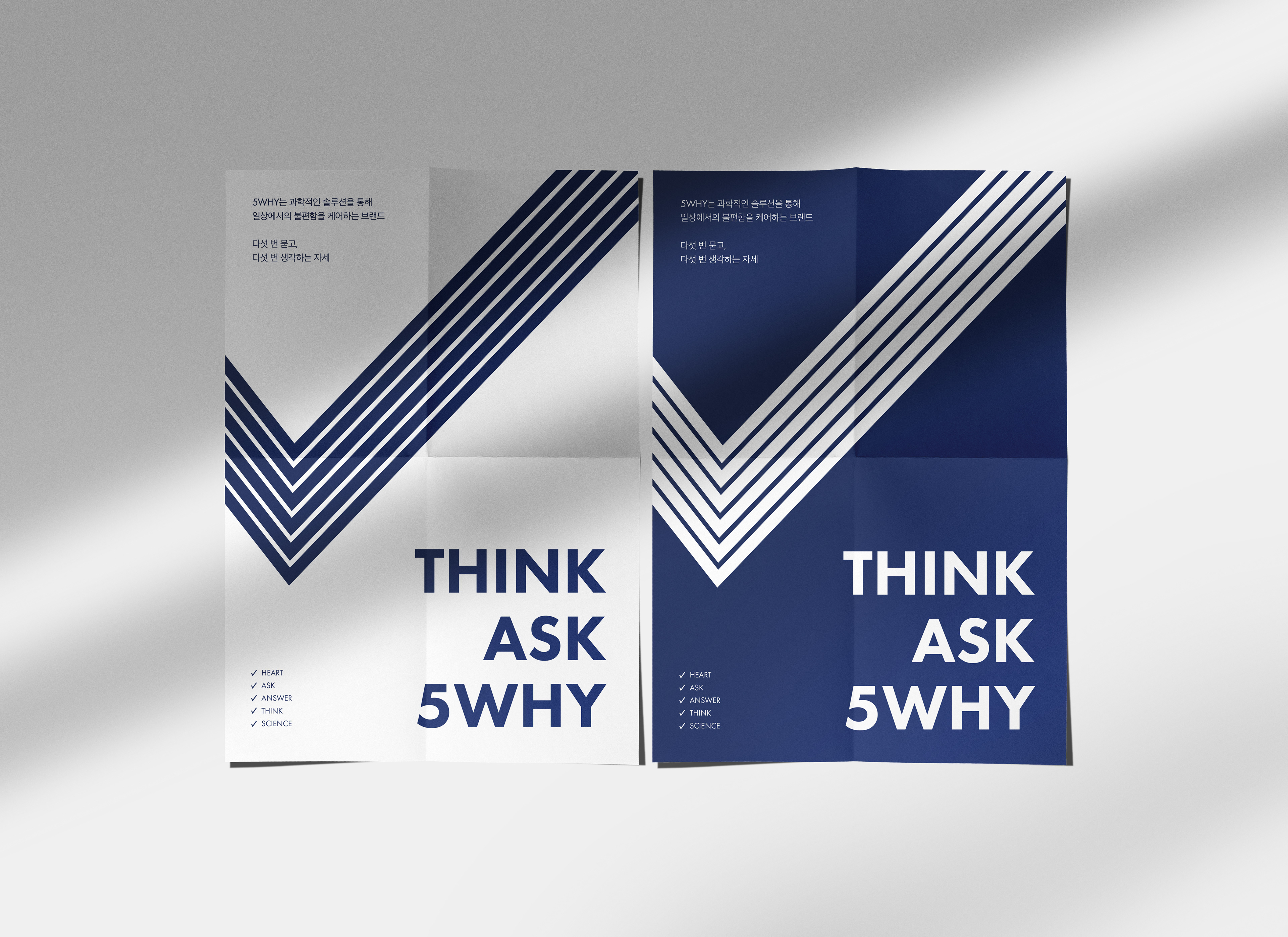
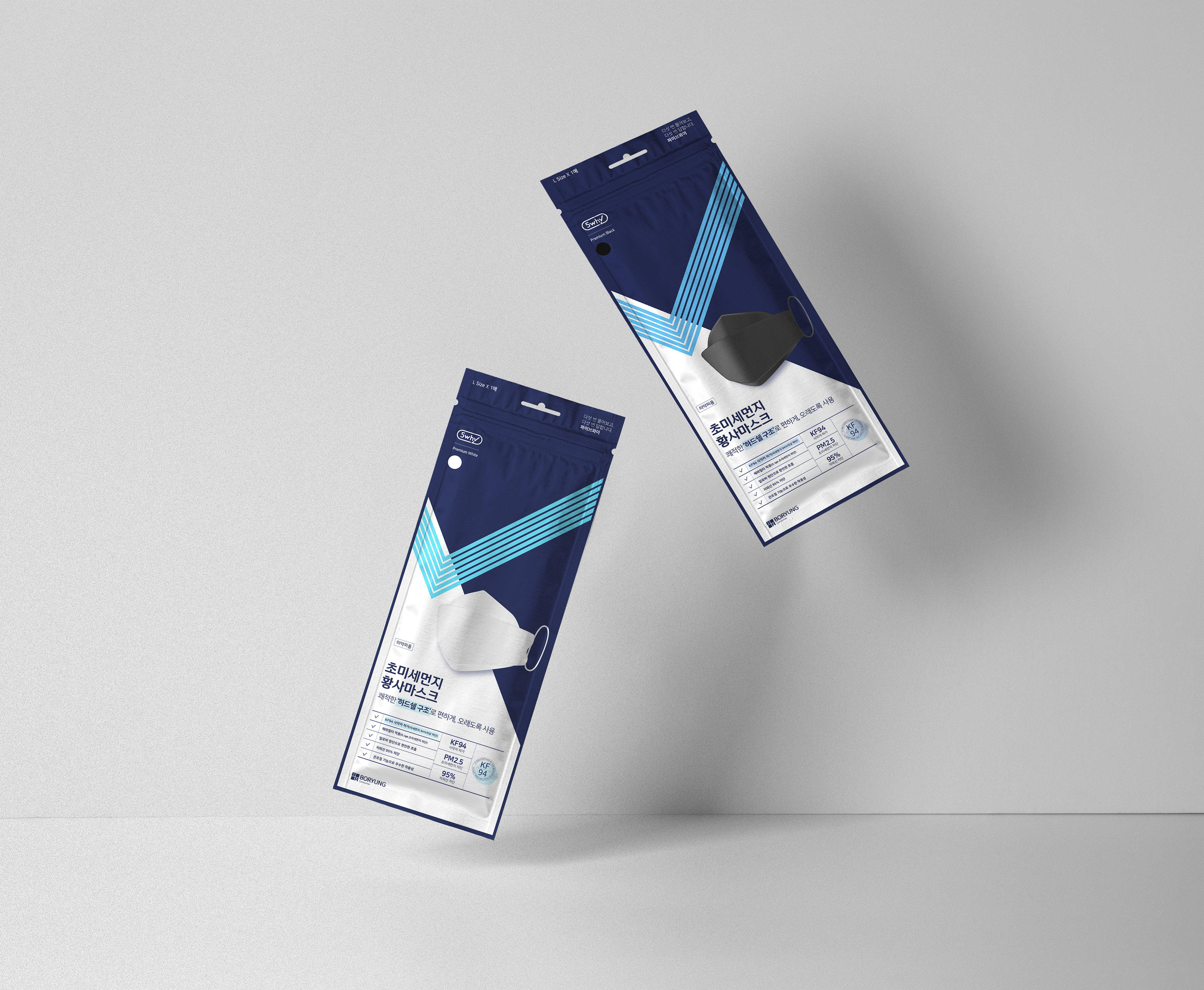
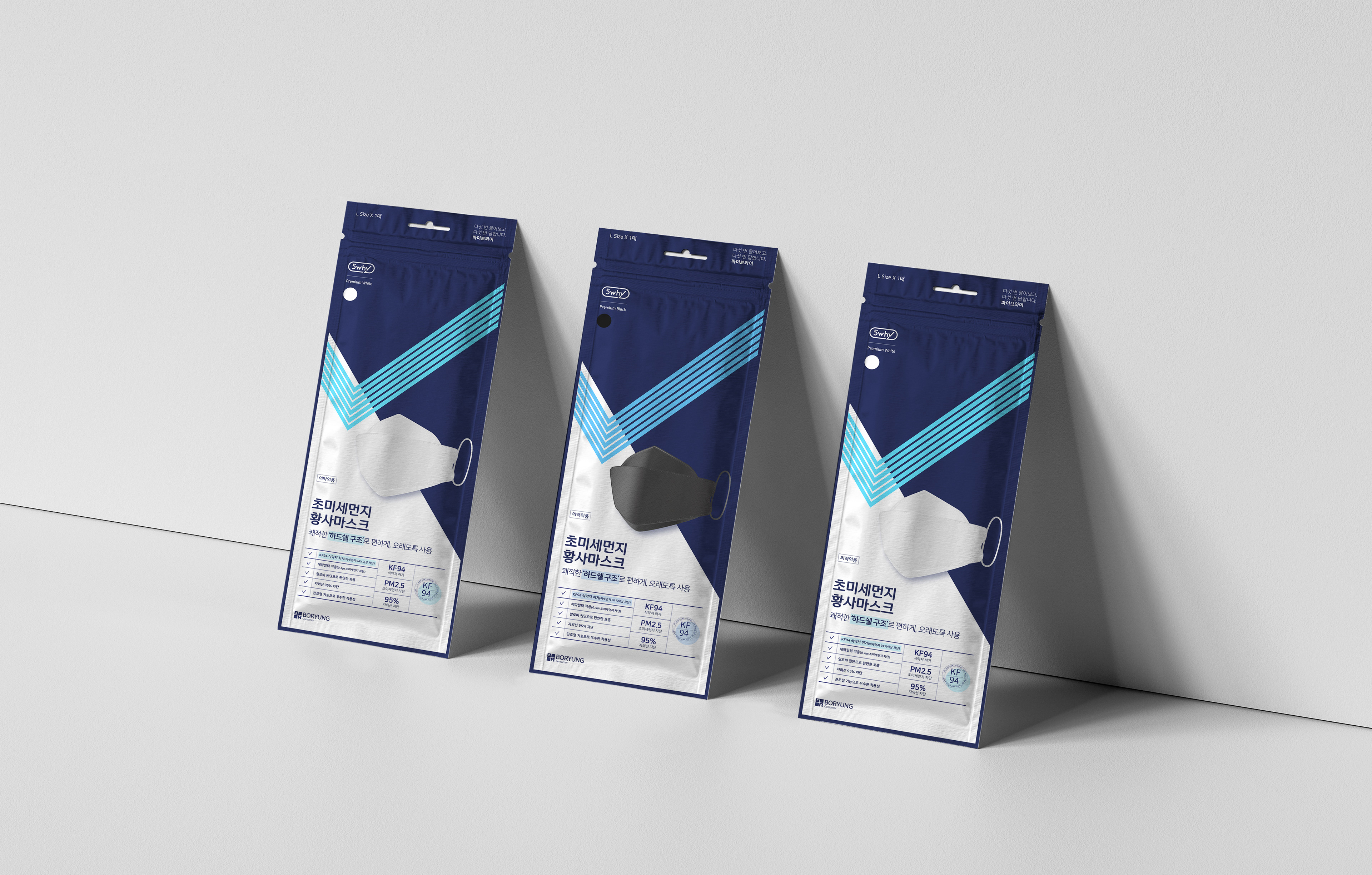
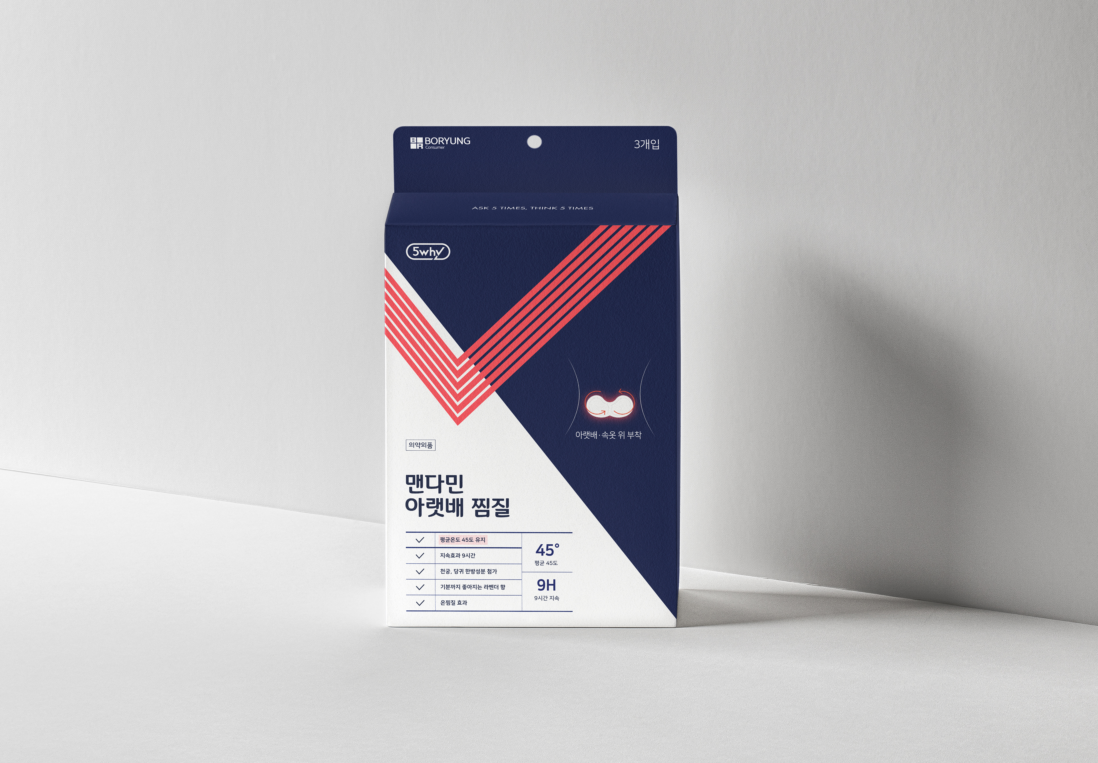
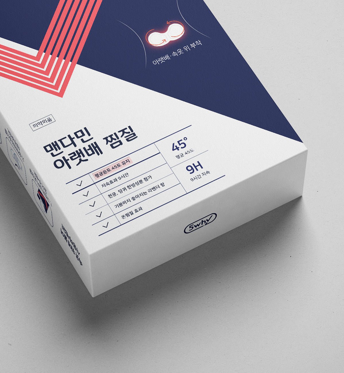
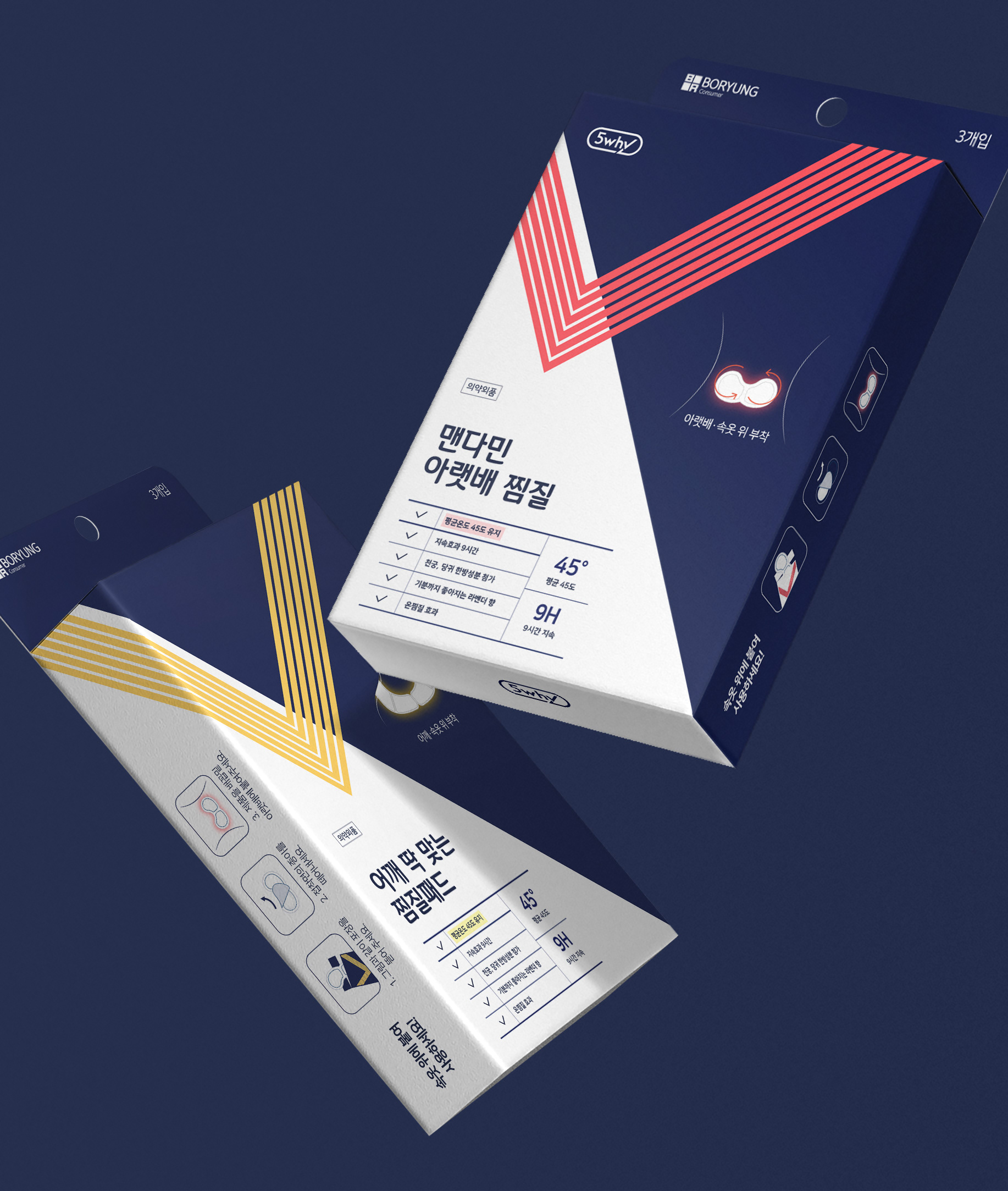
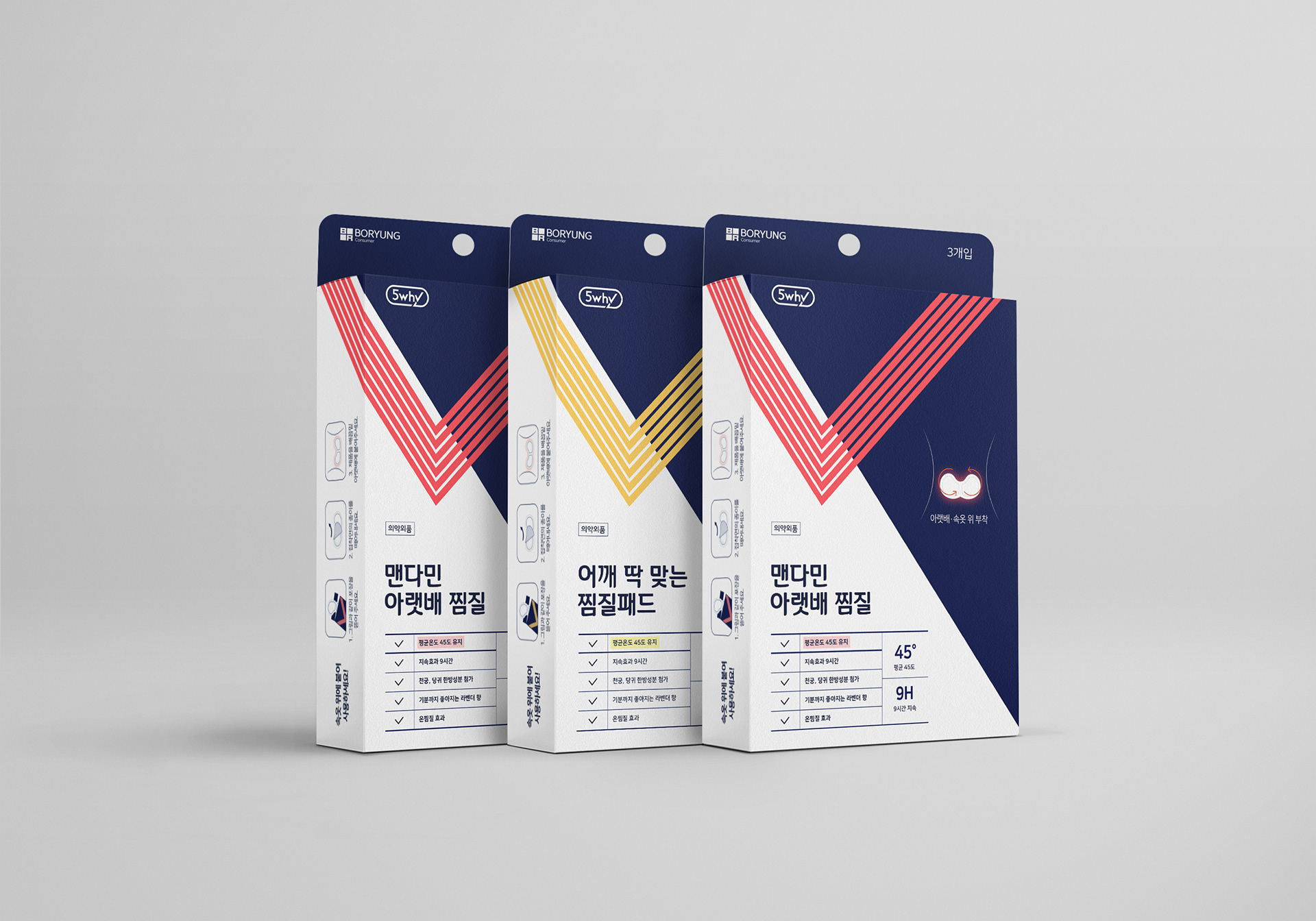
Graphic Motif
브랜드 아이덴티티는 5why가 하루에 5번 질문하는 것과 5번 하는 생각을 나타내기 위해 체크포인트로 나타냅니다. 체크를 통하여 소비자를 향한 진지함과 애정을 명확한 체크 그래픽 요소를 통하여 나타내려 하였습니다. 또한, 체크 요소를 특정한 각도에만 적용하여 브랜드의 일관성을 나타내려하였습니다.
The brand identity was expressed through checkpoints to express the thoughts and concerns of 5Why, which is asked five times and thought five times.We intuitively express our sincerity and heart toward customers with a clear graphic element called check. In addition, it shows the consistency of 5why brand design by having it at a certain angle.
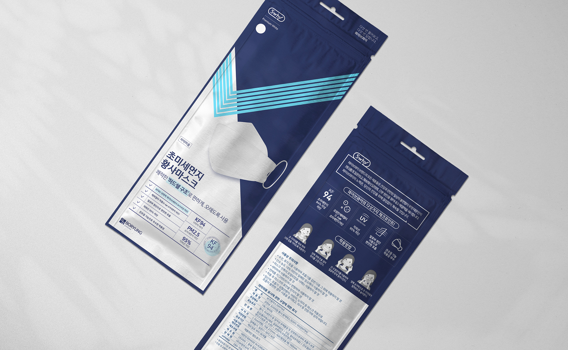
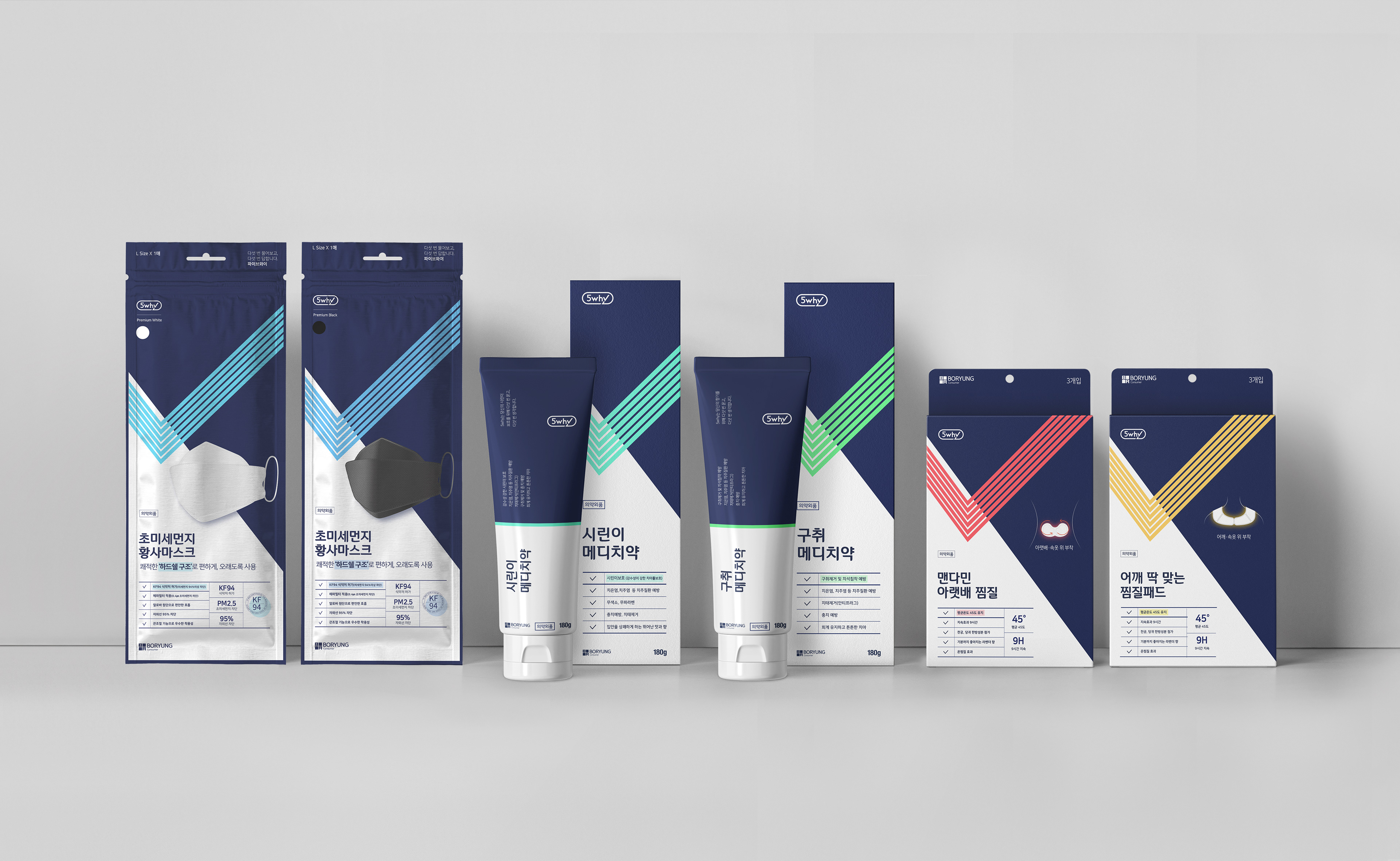
Applications
5why는 또한 브랜드 아이덴티티 강화와 브랜드 확장을 위하여 체크 모티프,컬러 그리고 타이포그래피를 활용 및 적용하여 많은 패키지를 제작했습니다. 그럼으로써 소비자에게 5Why만의 브랜드 다움을 전달할 수 있었습니다.
5why also designd many packages and applications with graphic motif(check), color and typography for Strengthening your brand identity and effective brand extension. By doing so, we can deliver 5why’s own brandness to customer.