BORYUNG BR TOX
Client / BORYUNG Pharm.
Services / Brand Identity Development, Packaging Design
© 2023 GRAFY.
Boryung Pharmaceutical, a big pharmaceutical company in Korea, wanted to launch a line of cosmetics with a cosmeceutical concept by fusing cosmetics and pharmaceutical technology. The main mission of our BX design was to showcase the features of Boryung's newly developed anti-wrinkle technology on the product, and we wanted to do more than just showcase the technology, we wanted to deliver a sophisticated and environmentally friendly brand experience to the customers who purchase the product. We also wanted to design the product's usability to be easily recognizable from the brand identity and packaging.
한국의 대형 제약회사인 보령제약은 화장품과 제약기술을 융합하여 코스메슈티컬 컨셉의 화장품 라인을 출시하고자 했습니다. 보령제약에서 새롭게 개발된 주름 개선 기술의 특장점이 제품에서 잘 나타나도록 하는게 저희 그래피의 주된 미션이었으며 저희는 단순히 기술을 보여주는 것 외에도 세련되면서도 환경친화적인 사용자 경험을 이 제품을 구매하는 고객들에게 전달하고 싶었습니다. 아울러 제품의 사용성을 브랜드 아이덴티티와 패키지에서 쉽게 알아볼 수 있도록 디자인하고자 했습니다.
Graphic Motif
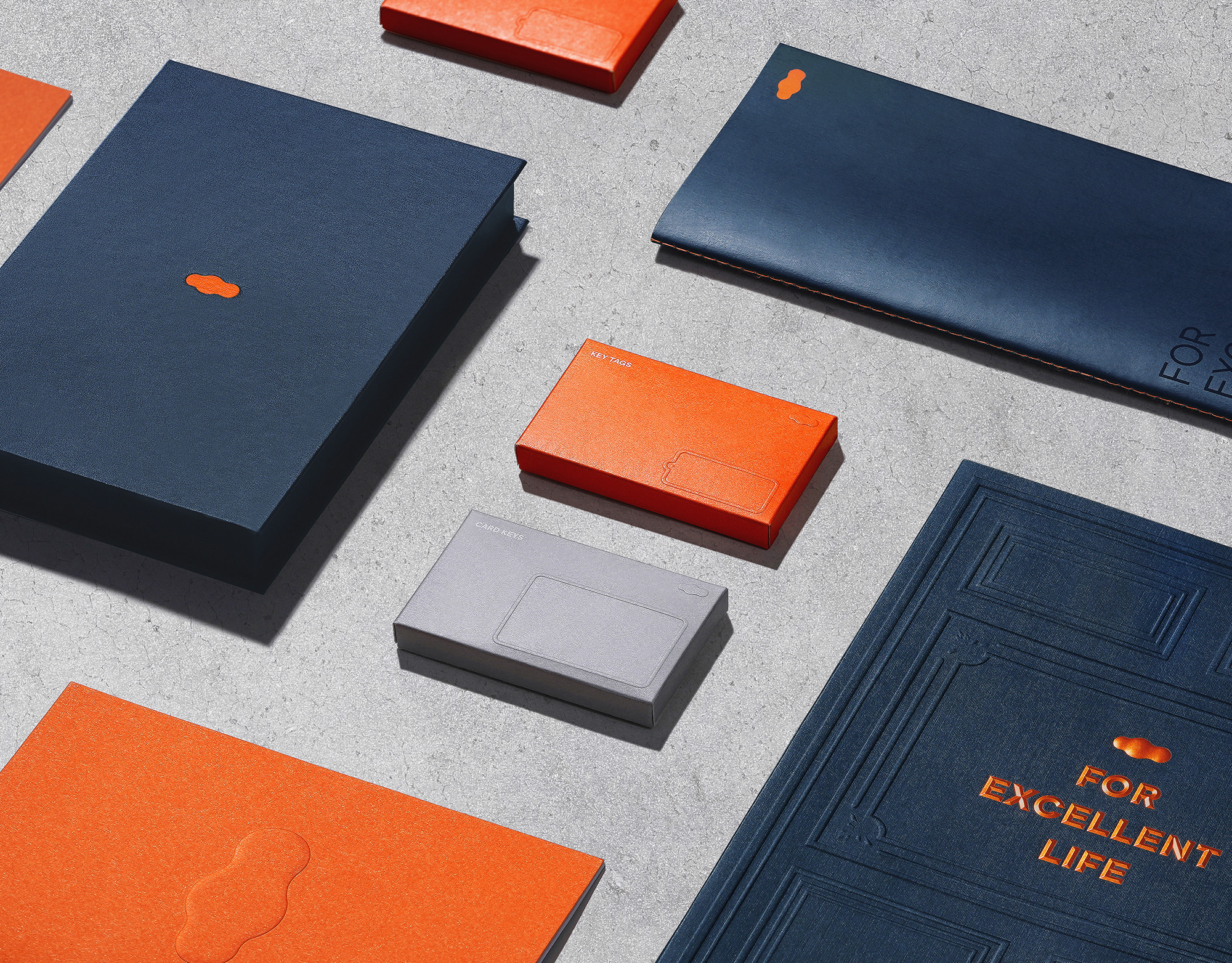
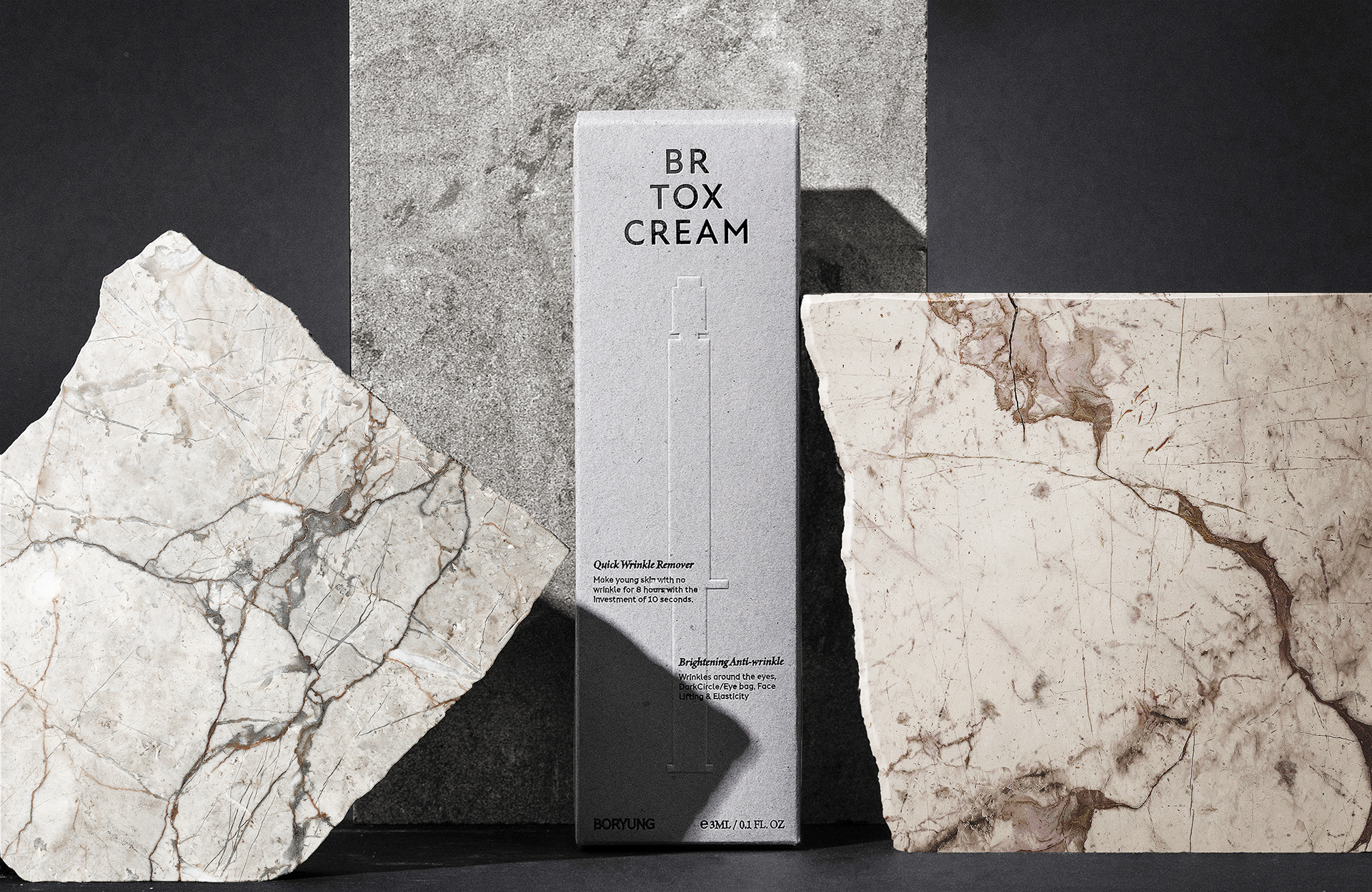
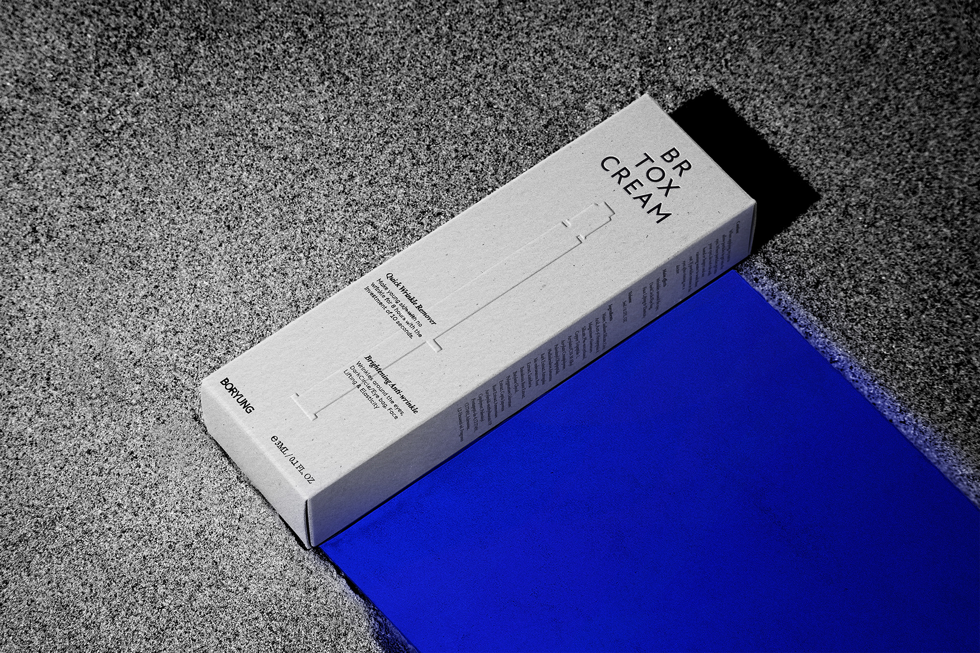
Turning back time is at the heart of the BR TOX brand. Boryung Pharmaceutical's new wrinkle reduction technology shows a noticeable improvement rate compared to past products that require long periods of use, and to achieve this, it has a usability that requires regular use of products divided into morning, lunch, and evening. Based on this, we utilized a clock and the passage of time according to morning, noon, and evening as graphic motifs.
비알톡스 브랜드의 핵심은 시간을 되돌리는 것에 있습니다. 보령제약의 새로운 주름 개선 기술은 과거 장시간 사용해야하는 제품들에 비해 눈에 띄는 개선 속도를 보여주며 이를 위해서는 아침, 점심, 저녁에 나뉘어진 제품들을 규칙적으로 사용해야하는 사용성을 갖고 있습니다. 이에 착안하여 아침, 점심, 저녁에 따른 시간의 흐름과 시계를 그래픽 모티프로 활용하였습니다.
Brand Identity
The BR TOX brand identity is like an essence gathered through the lens of the graphic motifs we defined earlier. We drew lines to each touchpoint in the user's lifestyle and time, creating a triangle and laying out the wordmark in that shape. The products in the BR TOX line may have different names for different contexts, but the basic layout follows the same rules.
비알톡스 브랜드 아이덴티티는 앞서 정의한 그래픽 모티프라는 렌즈를 통해 모아진 에센스와 같습니다. 사용자의 라이프스타일과 시간과의 각 접점에 선을 그어 삼각형을 만들고 그 형태를 레이아웃으로 워드마크를 디자인 했습니다. BR TOX 라인의 제품들은 상황에 맞춰 다른 명칭을 갖을 수 있으나 기본적인 레이아웃은 동일한 규칙을 따릅니다.
Color & Typography
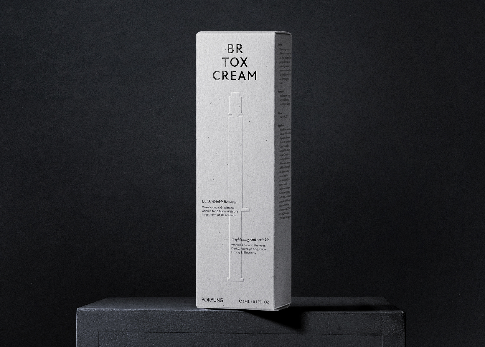
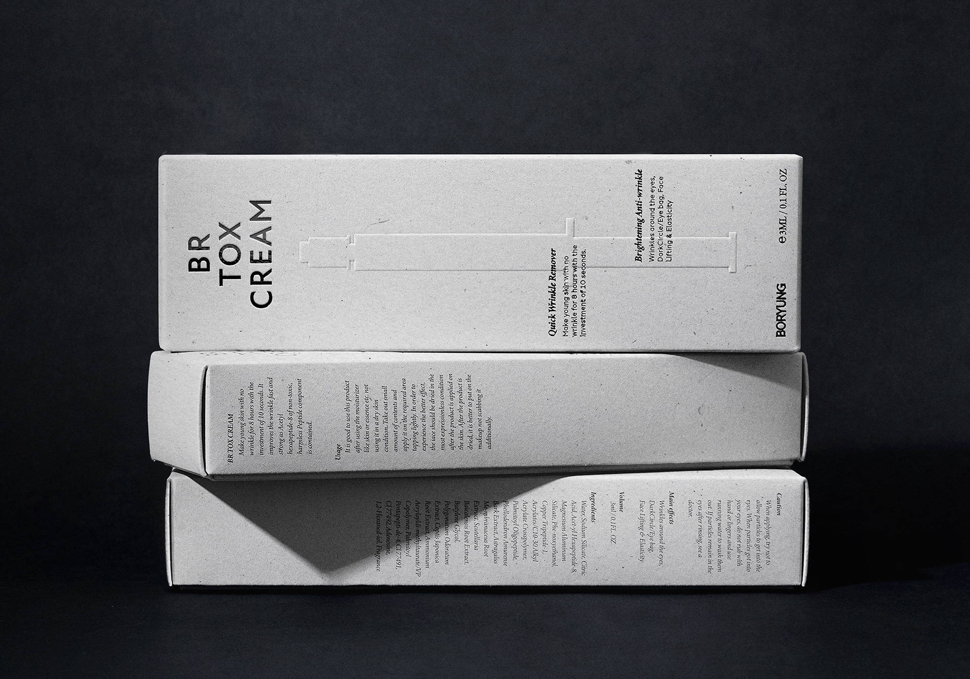
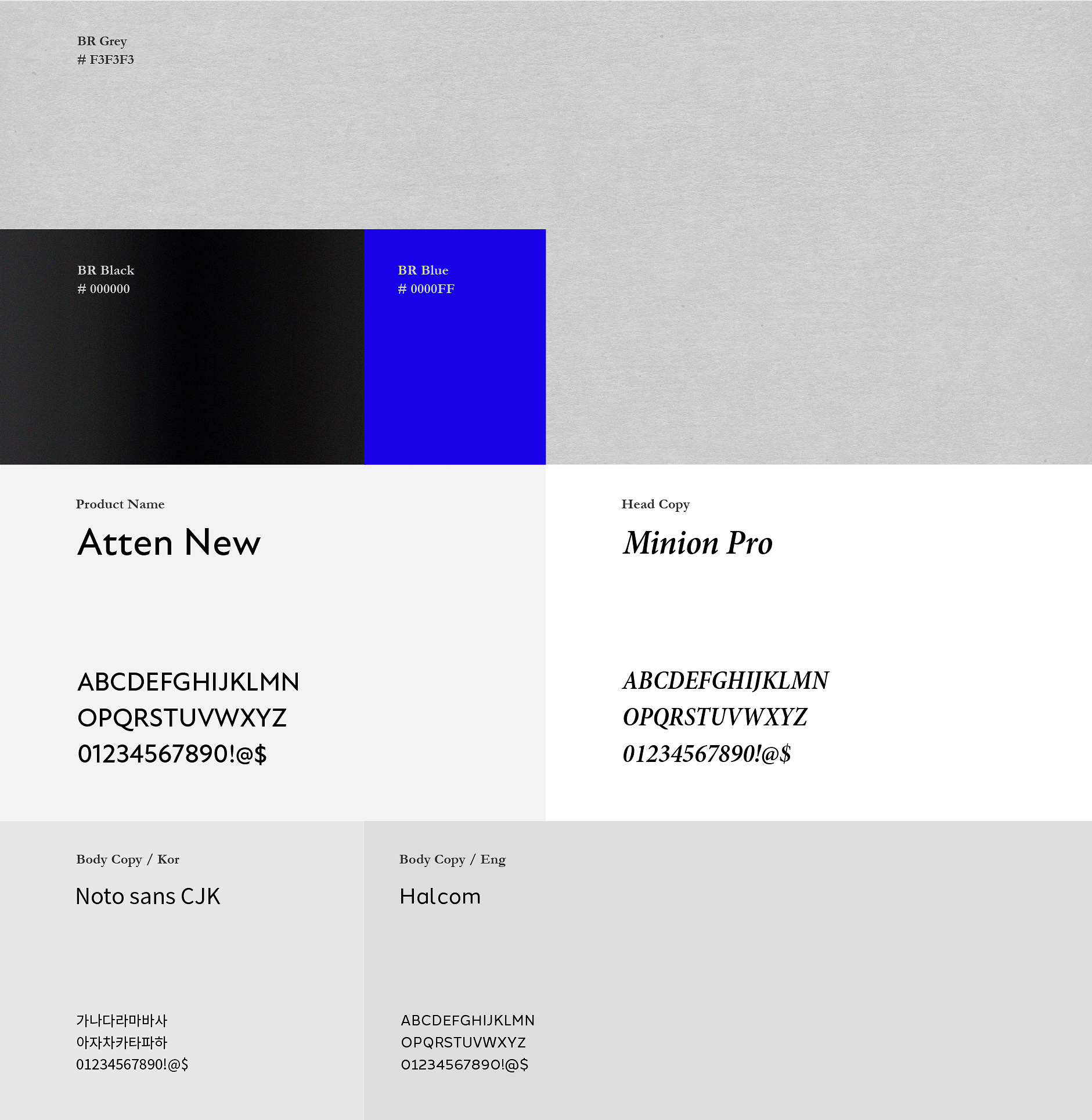
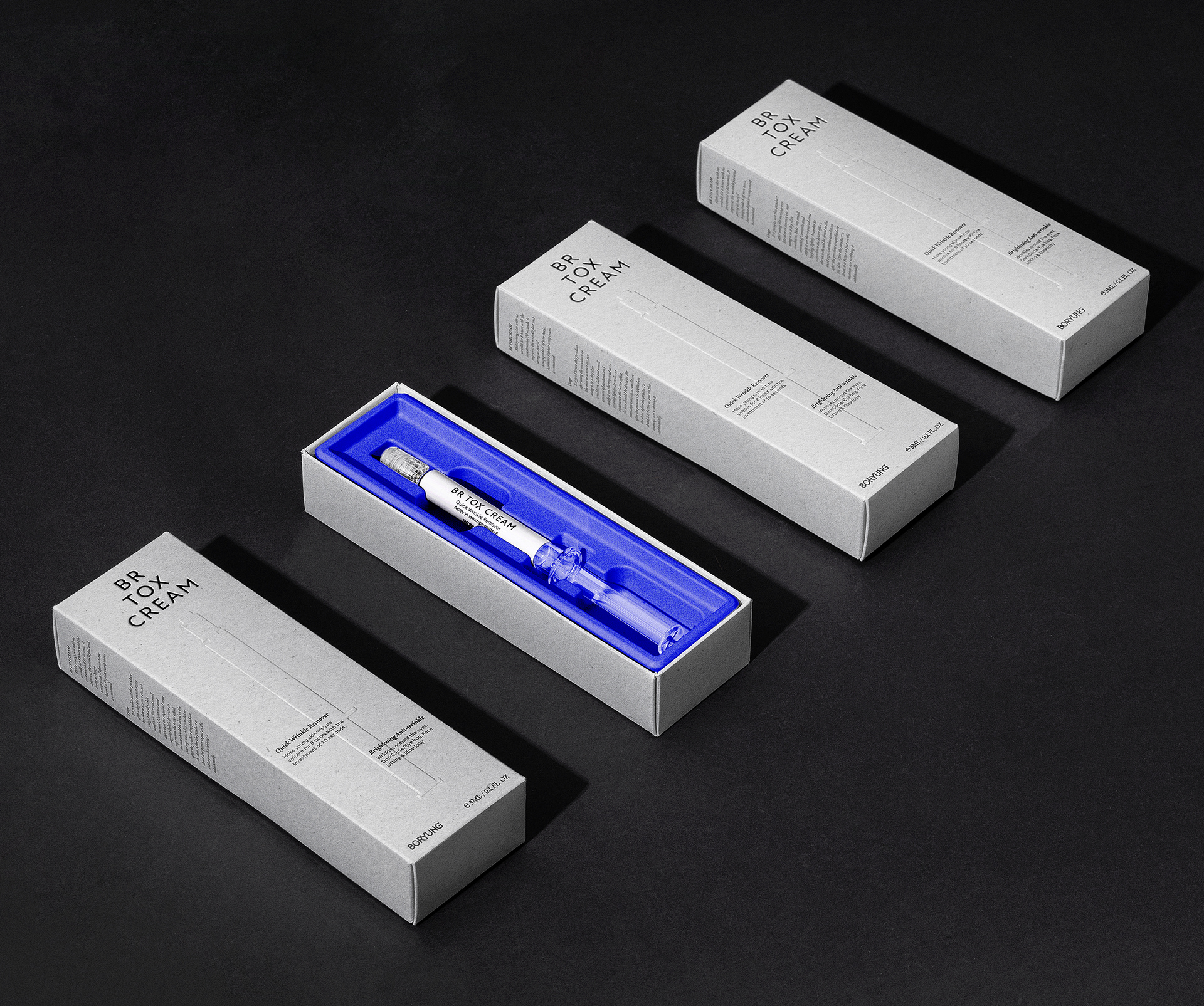
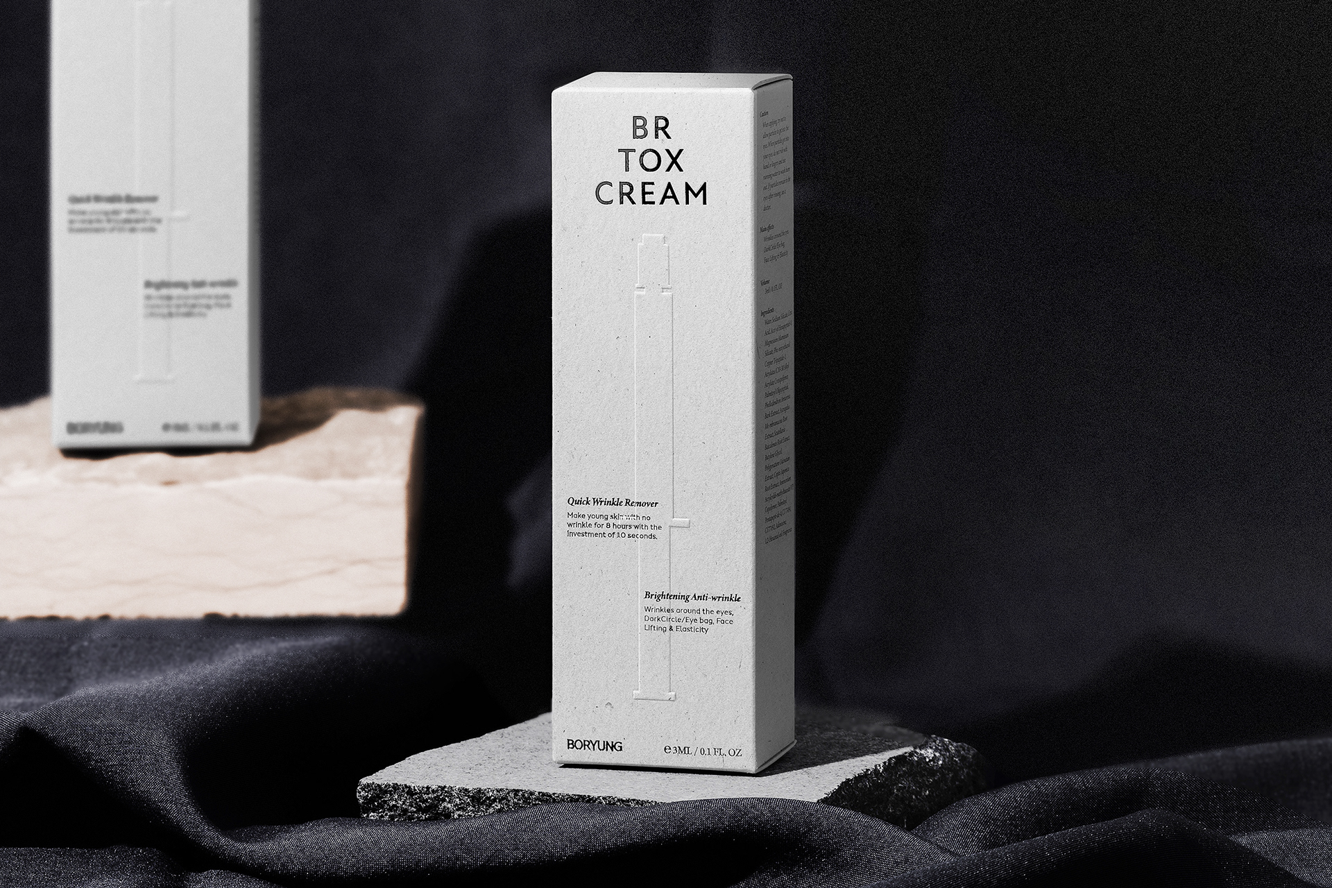
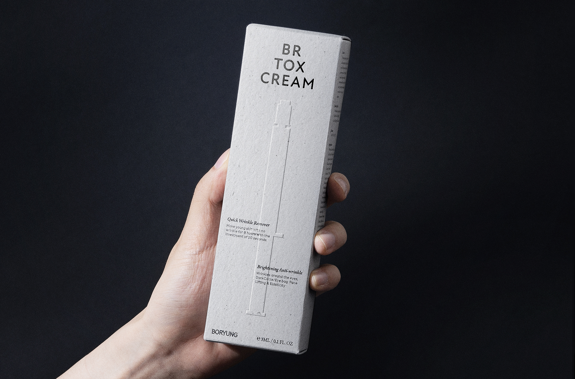
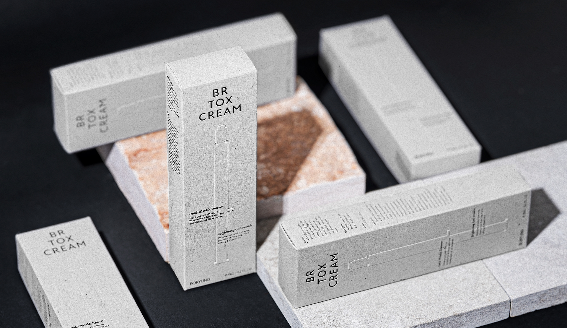
Since we used eco-friendly recycled paper for our packaging and applications, we felt that using a lot of color would go against this concept, so we strived to create a modern, upscale identity using a gray and black monotone. We combined the highly legible sans serif Aten New with the serif typefaces Minion Pro and Halcom to create a consistent image with magazine-like editorial elements. The accent color, blue, serves to offset the monotony of the monochromatic color scheme and was used on the inner container rather than the packaging.
패키지와 어플리케이션에 친환경 재생지를 활용했기에 많은 컬러를 사용하는 것은 이 컨셉에 반하는 것이라 생각했습니다. 그렇기에 그레이와 블랙 모노톤을 사용해 모던하고 고급스러운 아이덴티티를 표현하고자 노력했습니다. 가독성이 좋은 산세리프 아텐 뉴와 세리프 서체 엠니온 프로, 할컴을 결합하여 잡지 같은 편집 요소로 일관된 이미지를 유지했습니다. 포인트 컬러인 블루컬러는 모노톤 일색의 단조로움을 상쇄하는 역할을 하며 패키징 보다는 내 용기 등에 활용하였습니다.
Packaging Design
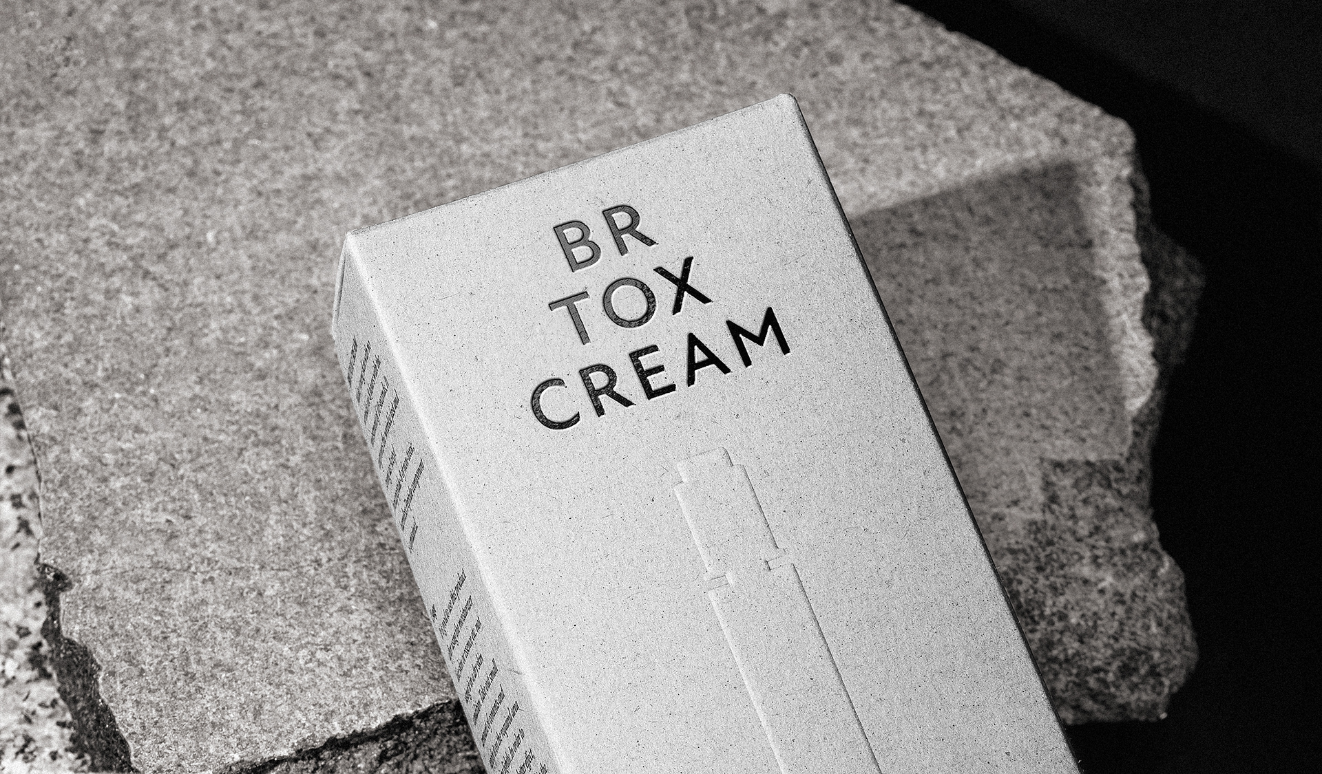
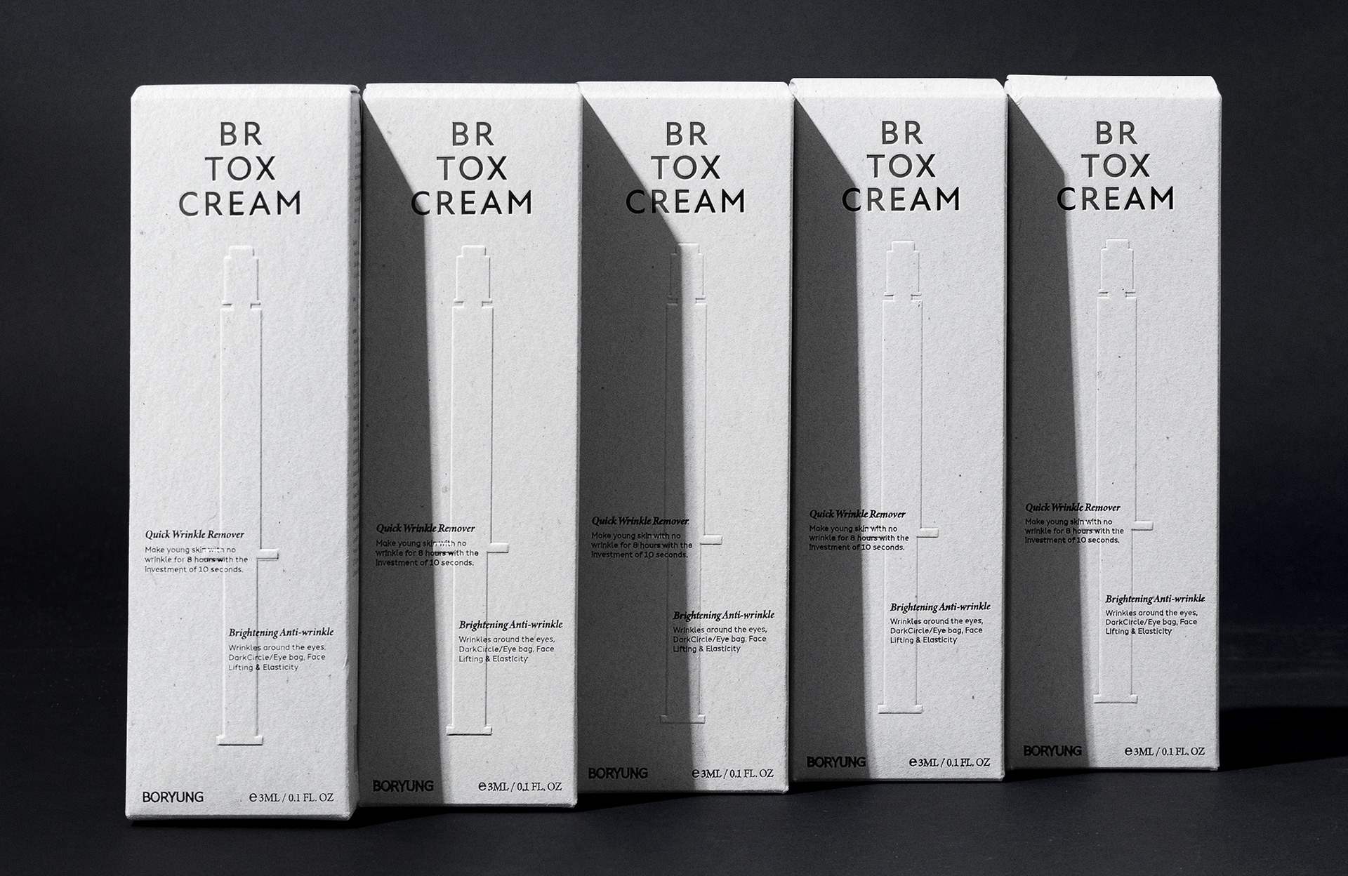
¹ Design for BR TOX brand recognition
The packaging was designed with a balanced triangular brand identity at the top center, artwork representing the product's container, and various selling point words. We took care to utilize a grid, which is often used in editorials, for a simpler and more organized arrangement, and the central selling point words were placed in the form of touching the two ends while the pendulum of a chiming clock swings left and right.
패키징은 상단 중앙부에 삼각형의 균형감있는 브랜드아이덴티티를 배치하고 제품의 용기를 나타내는 아트웍, 그리고 다양한 셀링포인트 워딩으로 디자인 하였습니다. 편집물에서 많이 쓰이는 그리드를 활용하여 보다 심플하면서도 정돈 된 배치를 할 수 있도록 신경 썼으며, 중앙의 셀링포인트 워딩은 괘종시계의 시계추가 좌우 진자운동을 하면서 양끝을 터치하는 형태를 생각하며 배치하였습니다
² Design For Environment And Sustainability
As Boryung Pharmaceutical is a company that adheres to ESG management policies, we thought that the company's brand should also communicate with customers in one voice and one language along with the company. Therefore, we proposed to use recycled paper for all packaging and applications that make up the BR TOX brand, which meant that we had to use limited printing methods and colors, but we tried to express the maximum brand essence within the limitations.
보령제약은 ESG 경영 방침을 고수하는 회사이기에 이러한 회사의 브랜드 또한 회사와 함께 한목소리, 한가지 언어로 고객과 소통해야한다고 생각했습니다. 그렇기에 BR TOX 브랜드를 구성하는 모든 패키징과 어플리케이션들은 재생지를 사용하도록 제안하였으며 이에 따라 제한된 인쇄방식과 컬러를 사용할 수 밖에 없었으나 그 제한 안에서도 최대한의 브랜드 에센스를 표현할 수 있도록 노력하였습니다.

© 2023 GRAFY.
GRAFY B/D 2-3F, 350, Dongil-ro, Gwangjin-gu, Seoul, Republic of Korea
contact / info@grafydesign.com / +82 70 8633 7222
-
If you want to see more projects, click on the links below
And our Instagram